Tuesday, November 25, 2008

Moving to a New Home

I have begun a move to WordPress and a new host for my website and blogs. I am merging my photography blog with Large Print Ideas at the new site, tim o'brien photos. You can find all new and old Large Print Ideas here. I will be customizing this page a bit in the future.

See you there!

Sunday, November 16, 2008

Low Vision Gadgets: Amazon Listmania

I am creating an Amazon Listmania list, Lov Vision Gadgets, for all those nifty little things that I fund unexpectedly helpful as a visually-impaired person. This is not a list for those expensive low vision aids. Instead, I want to highlight items not marketed for the visually impaired, but are still quite useful. The first item on the list is the LED headlamp about which I recently posted.

Suggestions are welcome!

Spelunking Your Books

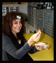
Inspired by a fellow visually-impaired photographer on Flickr (see the image of Sandra on the right), I went to my local outdoors store and bought an LED headlamp, the Tikka Plus, from Petzl. The headlamp is great for reading! I have been using booklights to supplement ambient room lighting for a while now, but have never been satisfied. My eyesight forces me to hold the book quite close, so these booklights are often obstructed by my own forehead. While the headlamp is not perfect, it is a significant advance in convenience and quality.

Personally, I would prefer a more diffuse light and one with more low intensity options. The light is designed to throw a wide beam outdoors or in caves, so the light hitting a page a few inches a way works more like a spotlight. I will experiment with some ways to diffuse the light a bit, possible some opaque paper, bu tI already look geeky enough with it on.

Hopefully, someone will come out with a headlamp designed specifically for the visually impaired, or at least for home honnyists whose need for close up lighting is similar. I have contacted Petzl with the suggestion.

Addendum: I have found a web site that has a headlamp specifically for the visually impaired। I can not say anything more about the lamp or the site as I have had no experience with either. Leave a comment if have any thoughts.

Stanza - Accessible E-Book Reader for the iPhone

Scanning through the Personal Tech section of the Times, I bumped into an interesting tidbit, "Tip of the Week - Turn Your iPhone Into an e-Book - NYTimes.com". I have an iPod Touch (the iPhone sans phone), so I ws intrigued, though remaining skeptical, by this tip. I just downloaded the app, Stanza, to my iPod and fell in love. On a technical level, it is a perfect application of accessibility for a visually impaired user. The font sizes can be adjusted with a very wide range. You can select font and background colors with a wide selection of choices, not just a simple reverse color scheme option. The screen rotates with the iPod, so you can read it landscape with the larger text. Pages can be turned with a simple flick on the screen. Best of all, it retains your choice of settings. I could not be happier with the accessibility.

Now I have to download the desktop version and hope that there are interesting e-books to read . . .

Monday, October 13, 2008

Tim on Twitter

Find out more at tim o'brien photos or just follow me on Twitter.

Thursday, August 21, 2008

AFB's Jitterbug Review

Most of the ways people find this blog is through web searches. One of the most popular search terms that bring visitors here is "high contrast cell phones" that directs them to this post. Surprisingly, to me anyway, this is the first entry that Google lists for this search term. However, my post is mostly a gripe about the lack of accessible cell phones. The only phone that seems to fit my criteria (accessible to those with low but functional vision) is the Jitterbug. I do not have one, so I can not review it. However the AFB has a good review, with images, here: An Accessible Phone Comes Calling: A Review of the Jitterbug Cell Phone - AccessWorld® - March 2007. So take a look at let me know what you think.

Alternative Google Color Schemes

Following up on my earlier post about the lack of accessible Vista themes and my current feelings on standard internet color schemes, I posted the following to the accessible Google Group: Alternative Google Color Schemes - accessible | Google Groups
For the visually impaired, Google's (as well as MS and most websites) color scheme is downright bad. Does Google have or could it develop an alternative accessible co or scheme? Not only should it be high contrast, but also light-on-dark. For me, I like yellow-on-black. Firefox and IE allow users to impose color schemes while browsing, but this method changes all text and background to the same two colors. This ruins the full use of each page. For example, in Gmail, the star feature becomes useless.For another, regular text and hyperlinks become indistinguishable. So this solution is only partial. This remains true for other websites and for Windows as well. Both Vista and XP have high-contrast color schemes, but there are both aesthetically unappealing (Visually impaired does not equal aesthetically unaware) and more problematic then helpful. Is this something that Google could/will implement? Is this something a third-party could do well? There are some third party tools (e.g. Firefox's Accessibar), but none are subtle enough to retain the full nature of each web page. Is anyone up for the challenge? Thanks! PS Can someone create a nice Vista/XP theme with accessible and aesthetic colors and font sizes
I will relay any useful responses.

Tuesday, August 19, 2008

The Touch Sight camera

Touch Sight Camera Allows The Blind To Take And Touch Photos | Device Daily
The Touch Sight, a concept camera from Samsung, is a great stride forward for visually impaired photographers with little of no vision. Instead of an LCD screen, it has a Braiille display that can present the image in a 3D format. Since it is only a concept, it is not for sale.

I will email the designer (Chueh Lee: chueh.lee@samsung.com), to offer thanks and encouragement. Maybe you have a moment to do so as well.

Monday, August 04, 2008

Curiosity & The Blind Photographe

I just stumbled across this essay, a blind flaneur » Curiosity & The Blind Photographer, on "accessibility in terms of culture and cultural production." A worthwhile read with some magnificent photos. What do you think? What is the link between accessibility and curiosity? Is access no longer a one-way street?

Amartya Sen paved new roads in economic thought when he changed the idea of poverty being absolute to being relative. To translate, Sen simply pointed out that what would have being accounted wealthy a thousand years ago would be accounted poverty today. Sen pushed a participatory (i.e. relative) concept of poverty. Someone is poor if they cannot fully participate in the economy (too poor for a phone, transport or sufficient nutrition for health, e.g.).

I can see clearly a parallel here to accessibility being defined as the ability to participate in society (or culture). Food for thought...

Saturday, July 19, 2008

Slashdot | GM Researching Windshields For Old Drivers

Slashdot is running an interesting piece on a new accessible technology in development; GM Researching Windshields For Old Drivers. It seems like a cool idea that would benefit all drivers, not just older ones.

I really appreciate seeing developments in technology oriented towards accessibility like this one. Maybe one day, this will allow partially sighted folks to drive as well.

Image Zoom : Firefox Add-on

To continue the theme of useful Firefox extensions, I also find myself using Image Zoom all the time. This extension adds another option to the context menu (the one that pops up when you use the right click button). With it installed, you have the option to increase the size of the image (i.e. zoom in) right there in the web page. You don't have to copy and paste it into another program or open it in its own page, you can just zoom in right there. Very useful!

In particular, I find it useful when shopping (either in Amazon or eBay) and the accompanying image is just too small to make out. Now I right-click on the image and zoom in. I have also found it useful on those DIY project pages when the illustrations are just too tiny to help.

Some images do not have good resolution, so, when you zoom in, the image 'pixelates' and becomes blurry. But that is not Image Zoom's fault. Give it a try. You will like it.

Thursday, July 17, 2008

Accessible Windows Vista Themes

As I noted in the last post, I have just moved to a Windows Vista machine. I have spent the last few days looking for a decent theme with large fonts and good light-on-dark contrast. There are none!

The Windows high contrast themes, besides being hideous, do not have large text. To check these out, you can either right-click on the desktop and select 'Personalize' and then to 'Windows Colors and Appearance' or go to the 'Ease of Access Center' Control Panel and then to 'Set Up High Contrast'. Either way, you are stuck with an ugly interface with the small font. The 'Ease of Access Center' has an option for changing something called DPI to make the font easier to read, but that only goes so far.

I checked out the trial version of WindowBlinds, but I could not easily find any accessible themes. After a frustrating few minutes with the software, I sent an email to the company who sells it, asking them if WindowBlinds offeres any accessible themes.

In the end, I spent a good chunk of time adjusting all the color and font settings in the 'Windows Colors and Appearance' panel. After a few mistakes and having to start from scratch a few times, I succeeded in creating and saving a minimally acceptable theme. It is not professional in the least. My next job is to figure out how to export and share it with you. For now, email me if you would like a copy.

Do you know of any useful themes? Do you know someone who can create one? Let me know!

Access Firefox: Because the Internet is for everyone.

Having just moved to a new computer, I have been installing software and making the system more accessible. In trying to find all the little ways to make Firefox more accessible, I ran across this website, AccessFirefox.org. They do a remarkable job of collecting all the Firefox themes ans extensions that help make Firefox a superior browser for ease of use. My favorite so far is Accessibar, which adds a toolbar to the top of the screen that allows you to control the text size and the colors of each website. The large icon themes are also quite useful.

The one item that is missing right now is No Squint. With the latest version of Firefox, No Squint allows you to control the full zoom and text zoom of each website. What is particularly useful is that it remember the particular setting for each site. I find that different websites require different adjustments, depending on the amount of text vs. images and how many columns the site has. Accisbar allows you to adjust font sizes, but is not site specific and has no 'memory'. I will recommend that AccessFirefox add No Squint to their list.

Do you know of any Firefox extensions or Greasemonkey scripts that make Firefox and the web more accessible? Please let me know!

Monday, April 28, 2008

VisionWalk 2008: Will you walk the Walk?

Our local VisionWalk, which raises money for the Foundation Fighting Blindness, is coming up in June. So I am getting serious about organizing my walking team and finding support. I would like to ask that you consider helping out your local walk in some way; with your feet, with your checkbook or even with your camera.

I am organizing Team Eureka for this year's VisionWalk in Raleigh, NC. If you will be in the Triangle area, please consider walking with us. You can join the team, help us raise money or assist us in whatever way you would like.

Thanks! -

Thursday, April 24, 2008

Study explores how blind pedestrians can cross safely

I spotted this article, Study explores how blind pedestrians can cross safely, in the Triangle's News & Observer. "Walk faster" does not seem like the best technology for pedestrians, never mind visually impaired ones.

Sunday, April 13, 2008

My Point Exactly

This is what I have being saying for a while now:

“A lot of technology was originally developed for people with severe disabilities,” Mr. Sinclair said. “But these solutions are proving valuable to a much broader range of people.”

Th Times is running a piece, At a Certain Age, Simplicity Sells in High-Tech Gadgets , in today's paper. It is worth the read, though it is light on examples. The article mentions the new Jitterbug, some new GPS units and some desktop concessions.

When are these companies going to realize that a few easy design tweaks can make their products more appealing (and accessible) to a wider audience? More high-contrast visual interfaces, more auditory and tactile cues, more text-to-speech. None of this would be expensive, bue all of it would make products better.

Thursday, December 20, 2007

Finally, Pogue Speaks to US

David Pogue over at the NY Times has addressed our main issue in his blog: Gadgets With the Blind in Mind - Pogue’s Posts. A look through the comments so far (over fifty as of now) shows quite a range of responses from ignorant trolls to many insightful contributions. It is worth reading the comments (if you can drain the red from you eyes from the reaction to the troll comments).

Thursday, November 08, 2007

Transit Info by Text Messages

Have you ever needed to take a bus or train but not had a schedule handy? Have you ever looked at the posted schedules at stops and found them missing or out of date? Or, like me, do your find printed schedules too difficult to read? I have a plan. However, I am not the first to think it up, as it has been implemented in some cities.

Public transit systems ought to offer schedules via text messages. You can access all sorts of data, from nearby restaurants to movie schedules to sports scores via Google's SMS system (see description at sms.google.com). Why couldn't the same system apply to transit schedules?

If each stop were label led with a stop ID, then a person waiting at the stop could send the stop ID to the designated text message service (e.g. GoTTA for the Triangle Transit Authority) and receive in return the next five buses expected at the stop. Sending the bus line (e.g. CHT NS for Chapel Hill Transit's NC route or TTA 412 for the TTA's 412 route) would return the remaining schedule for that bus for the day. I think that this system would be very useful. This could also be hooked up with those new real-time bus/train notification systems.

With such a system, transit authorities would not have to roll out real-time schedule signs at every stop to provide riders with access. Bus systems would not need to print and distribute so many bus schedules. Riders could access this information anytime and from anywhere.

This system makes buses and trains more convenient for everyone, but it also makes them more accessible to the disabled. Disabled people must rely disproportionately on public transit and have greater challenges reading and using available schedules. So I hope more cities adopt such systems for their accessibility as well as their convenience.

Saturday, September 15, 2007

Zooming in the new IE

At first, I did not like the new Internet Explorer (IE). It buried the accessibility options I like most (text size and ignore colors specified on webpages). There is one new redeeming feature, the new zoom.

Zoom does what it says. Just like zooming in and out with your camera, zoom lets you magnify websites at any level of magnification you desire. I usually keep it between 125% and 200%, but it depends on the website. Very useful. Unlike text size, zoom works on all web pages. The only downside is that many pages will extend eve further off the right side of the screen. The solution for that has been to get a wide-screen monitor.

Zoom's official home is under the Pages menu right about my other favorite, text size.The excellent news is that there are two easier ways to access it. First, the bottom right corner of the IE window has a "change zoom level" drop down menu. Even better are the keyboard controls; Ctrl-+ to zoom in and Ctrl-- to zoom out.

Time to zoom away.

Fast Food Menus

Yet another gripe I have are the wall menus at fast food joints. From food court Burger King to local McAlister's Deli to the airport Starbuck's, all of these places have their menus on the wall, but no handy large print paper menu on hand. Asking the over-worked and under-trained cashier for help picking your meal either ends up in confusion or inappropriate questions and always holds up the line full of hungry folks. When I was a kid, I always picked and memorized one thing, "doublecheeseburgerlargefiriesandacoke". This worked well for McDonald's and BK's, but did not extend well to other spots. It definitely does not work today since I do not eat at either burger joint anymore. [See Fast Food Nation.] Why can't these places have a hard copy of the menu available?

I know that some do, usually a take-out menu. This is useful, but it would not cost these big franchisers a lot to design and distribute a large print version. Some might say that the menus are available (mostly) on the web, but who is going to print out and carry around a binder full of menus on the off-chance they hit a fast food spot that day?

Food for thought.

Wednesday, September 12, 2007

The Graying of the Web (NYTimes)

The Times has a great article on the elder segment of web users. They may be evolving into to major new web force with very different web usage and consuming patterns. In addition to virtual changes, I think the baby boomer generation will push designers to develop more accessible (but still stylish) tangible products.

Wednesday, May 09, 2007

VisionWalk

This year I am doing the VisionWalk (http://www.visonwalk.org/) fundraiser for the Foundation Fighting Blindness. The FFB does research on several vision disorders, including mine. If you have a few dollars to spare, please consider sparing some. I have a Visionwalk page at http://www.fightblindness.org/goto/tco . No pressure!

Tuesday, December 26, 2006

New Audio Tours: iJourneys

Today's NY Times has an artucke about a new audio tour company, iJourneys. It looks like a good one.

Saturday, December 23, 2006

Inaccessible Web Design

This is what a bad website looks like after I have set the font sizes so that I can read them. This is from Audible.com.

Wednesday, December 06, 2006

Second Success with Unabridged Audible.com Releases

As you can read in earlier posts, here and here, I have been waging a one-person campaign to see more unabridged audiobooks on Audible.com. I had a first success with Ron Rosenbaum's Explaining Hitler. Just a few weeks ago, I saw that Doris Kearns Goodwin had released the unabridged version of Team of Rivals on Audible.com. I had emailed Ms. Goodwin several months ago about doing just this. I can not be sure that this was not coincidence, but hopefully this counts as a second battle won.

Wednesday, November 01, 2006

Flickr: Blind Photographers

I have started a Flickr group for Flickr: Blind Photographers. If you are not familiar with Flickr, it is a photo-sharing community. This group is meant for blind and visually impaired photographers to display their work. Please check it out. Blind Photographers. Get yours at bighugelabs.com/flickr Technorati tag:

Monday, October 09, 2006

Portable Player Portal Main Page

Here is a nice review of iPods, other digital music players and related software from an accessible perspective: Portable Player Portal Main Page. I am interested in Rockbox, which has a voice-based interface, but it does not allow for Audible.com playback.

Medialoper » That’s What I Like: Audible.com

I have to second this opinion: Medialoper » That’s What I Like: Audible.com. Listening to audiobooks while working out gives me the opportunity and discipline to listen to those long books that can't be listened to while going to sleep. I recently made it through Jenkins' biography of Churchill [Churchill: A Biography] and now am finishing the second volume of Foote's history of the Civil War [The Civil War: A Narrative (3 Vol. Set)].

Thursday, August 17, 2006

Pogue’s Posts - As We Get Older, Type Gets Smaller - Technology - New York Times Blog

Pogue's post this past week, As We Get Older, Type Gets Smaller, addresses a major issue that I think about too much. I reset the screen resolution, override default fonts and sometimes use Zoomtext.

Thursday, July 20, 2006

Google Accessible Search

This, Google Accessible Search: "Accessible Web Search for the Visually Challenged". looks to be a great new resource for the visually impaired. Not only does it provides better place for the visually impaired to search, but should also put pressure on all web developers to create more accessible web sites.

Wednesday, July 19, 2006

Off-Topic: Changing Things

I am a big believer in fixing problems that I find. I recently discovered some locations incorrectly mapped on Google. I submitted a correction to Google, but I also let the affected businesses know. Here is a copy of my exchange with one of them.

Their response:
wecare@m400.alexlee.com to me Good afternoon, Thank you for contacting the Lowes Foods Customer Care Center. Thank you for bring this to our attention. We have forwarded your comments to the appropriate company official. Thank you for giving Lowes Foods the opportunity to serve you better and for shopping at Lowes Foods. Leslie Robbins Lowes Foods Customer Care Center
My email:
to lfscustomercare Your location at the Chatham Crossing Shopping Center in Chapel hIll is incorrectly mapped on Google Maps. It shown across from Southern Village here, As you know, it should be listed here. I submitted this to their contact us page, buy I am only a user. As an effected business, your request is more likely to be heeded. The reason I am sending you this is that I am legally blind. I live in ... and google mapped some nearby stores (CVS, Lowes, etc.) and found them to be ... Imagine my surprise when I went for a walk and never found them. Please see if you can have this fixed to save some other poor soul this trouble. Thank you

I hope this works. Either way, I will keep trying.

Saturday, May 20, 2006

First success with "More Unabridged Auiobooks!"

I have had my first success with my grass root campaign for more unabridged audio. I received an email this week from Ron Rosenbaum, the author of Explaining Hitler. I read this book a few years ago on cassette, but could not find it on Audible.com. I emailed Mr. Rosenbaum, who was kind enough to see that his book will be published on Audible.

From the email:

It took a while but we've made arrangements for books on tape to make the Hitler book available on audible.com. I'm not sure when it will become available (just signed the paperwork) but thought I'd let you know it's happening. Best, ron rosenbaum

Thank you, Mr. Rosenbaum.

Thursday, April 27, 2006

Response on Cell Phon High-Contrast Color Schemes

I had a response form Verizon (who obviously did not read my initial message carefully) which just blew me off. Here is the response and my response:
As I said in the original message, I had difficulty testing each phone in the store. First, the store's inventory did not match the online store's inventory. Second, I was unable to turn on many models. Lastly, it was not easy to search for the correct font/display.color/theme settings on each phone that I could turn on since I am legally blind. Can you at least suggest it to Verizon's accessibility team that they (1) test each phone for high-contrast color scheme options and publish the results and (2) they suggest /require the suppliers to add high-contrast color scheme options if they do not already have them? Thank you. On 4/27/06, Verizon Wireless Customer Service S - Hide quoted text - wrote: Thank you for contacting Verizon Wireless through our website. I appreciate your inquiry regarding starting service with Verizon Wireless. My name is Desmond, and I am happy to assist you today. Unfortunately, I am unable to inform you which handsets have the contrast capabilities you are in need of because I do not have each handset available to test for you. I would recommend visiting your closest Verizon Wireless direct store which will have working models of the handsets we offer for you to test. I apologize for any inconvenience this may cause. To obtain a list of stores in your area, please click on the following link, which will direct you to our "Store Locator" page: www.verizonwireless.com/storelocator We provide three options to choose from for obtaining new service with us: 1. You may place orders online by clicking on the following link, www.verizonwireless.com/plans which will direct you to the "Plans" page of our website. 2. You may visit a local Verizon Wireless store in your area, where a sales representative will be happy to assist you. To obtain a list of stores in your area, please click on the following link www.verizonwireless.com/storelocator which will direct you to the "Store Locator" page of our website. 3. Additionally, service may be ordered over the telephone by calling our Verizon Wireless Sales Department at 1-800-2-JOIN-IN (256-4646). A representative will be happy to assist you with your request. We appreciate your business. Please contact us at our website for any of your future needs. Again, thank you for using Verizon Wireless products and services. Sincerely, Desmond Verizon Wireless Customer Service "We never stop working for you!" If you have received this e-mail in error or are not the intended recipient, please notify us immediately by replying to this e-mail and deleting it and all copies and backups thereof. If you are the intended recipient and are a Verizon Wireless customer, this response is subject to the terms of your Customer Agreement.
So to whom can I write, if I want a real reesponse?

High-contrast Cell Phones

I am looking at getting a new cell phone. I don't need a fully voice-controlled, phone, but I would like one where the text is large and easy to read. I am having a hard time finding one. Companies do not advertise high contrast text settings, even if they have them.

My wife and I are currently planning to leave our current cell phone provider and are strongly considering Verizon. The main issue is that I am legally blind with partial sight. I don't need the text-to-speech features of the LG VX 4500. I need a phone with a clearly legible text where the font color contrasts sharply with the background color (black on white, white 0r yellow on black, etc). I went to a Verizon store to check the phones, but it was not possible to check many phone (the stores inventory did not match the website, many of the phone on display could not be turned on and it was not easy to check the Display Settings of the phones that were on). Is there a way to find out which phones have high-contrast color themes? The only one I could find is the CDM 8945, but I don't need all the VCAST features and don't want to have to pay for them. A serious attempt to help would be appreciated.

UPDATE: I have posted a link to a review of the Jitterbug phone. The Jitterbug might be the best phone for folks with low, but functional, vision.

Monday, April 10, 2006

Tuesday, March 28, 2006

Update on "More Unabridged Auiobooks!"

I have heard back from one more publisher in my mini-crusade for more digital unabridged audiobooks. ________________________________________

From: @tantor.com Date: Mar 27, 2006 11:49 AM Subject: Re: Releasing more unabridged books on Audible.com

Thank you for your interest in Tantor Media. I am thrilled to hear you have enjoying our selection of titles. We are in the process of renegotiating our contract with Audible and I'm sure we will continue to release our titles available for download with Audible.

We do not have any current plans to release another William Gibson novel on audio, but will keep your suggestion in mind and certainly appreciate your input.

Sincerely, Tantor Media 114 Mill Rock Rd E Old Saybrook, CT 06475 877-782-6867x24 www.tantor.com

Friday, March 24, 2006

Font Size in Balloons

PC Magazine has a tip on dealing with Font Size in Balloons. This should help you resize the font in those little comment balloons in Word.

More Unabridged Auiobooks!

I have begun a personal campaign to get more unabridged audiobooks released, especially on Audible.com or iTunes. I have contacted several publishers, including Highbridge, Tantor and Basic Books among others, and several authors, including Peter Bernstein, Doris Kearns Goodwin, Jagdish Bhagwati, Joseph Stiglitz, Simon Singh, and Ron Rosenbaum among others. Some have even gotten back to me.

I have collected and attached all of the responses that I have collected so far. I stripped off the contact information, so, if you are inclined to contact the same people, drop me an email and I can share those with you.

Does anyone know how to contact the big publishing houses like HarperAudio, Simon & Schuster or Random House?

Some have argued that distribution costs for audiobooks, especially unabridged versions of longer books, are too high. I would think that this is true for distrubitng books via CD or cassette, but not electronically via Audible.com or iTunes. I know some authors are worried about DRM (illegal file sharing), but my impression is that most illegal copies are from CDs or cassettes and not pirated from iTunes or Audible.com.

___________________________________

From: perseusbooks.com Subject: RE: Releasing audiobooks via Audible.com

Hello - Wonderful to hear of your interest in the Basic Books list.

Unfortunately, since we do not produce our own audiobooks, it would be up to audible to sub-license those titles from us.

It would be appreciated if you would let them know of your interest. If Audible then feels there is a wider market for these books they would contact us and let us regarding licensing.

Again, thanks for your interest in our publications. It's always a good thing to hear directly of a reader's interest.

Best, Bill Smith Domestic Rights Manager The Perseus Books Group

___________________________________

Subject: FW: Question for Daniel Yergin about releasing his books on Audible.com

Hi,

I work in Dr. Yergin's office--thank you for your inquiry. Do you know how Audible.com works? I can't find anything on their website. Do they just take an existing audio tape or do they sometimes make their own versions?

Any info you have would be appreciated and we will look into it.

Best regards, Amy Kipp Executive Assistant to Daniel Yergin

___________________________________

Subject: Re: DORISKEARNSGOODWIN.COM

One of the great joys of writing is receiving reactions like yours. I am glad you are enjoying my book on LBJ.

Right now, the unabridged version of Team of Rivals is only available in libraries. I have passed your note on to Simon & Schuster and we'll let you know if the unabridged version becomes available for retail purchase. I hope in the meantime you might hear the abridged version.

Thank you for taking the time to write to me.

With all best wishes, Doris Kearns Goodwin

___________________________________

From: HighBridge.Audio Subject: RE: Gnd, Germs and Steel

Thank you for your email to HighBridge Audio. I apologize for some of our abridged titles. We have been trying to limit our releases to unabridged, but sometimes the length causes the price to be prohibitive for us to cover costs and publish. We have tried to make the cost workable for everyone, but it doesn't always work out that way on the longer titles.

Our library customers prefer the unabridged titles as well, so we hear this from them as well. I have passed your suggestion on to our production manager and editors for HighBridge. They appreciate your feedback. Audible is a growing business partner for HighBridge and you should be finding more of our titles with them in the future.

Thanks for the comments about our catalog. Our staff works hard to find good titles to publish. Have you read Secret Life of Bees? That's a great book!

Peter Regan HighBridge Audio

___________________________________

Subject: Re: Releasing unabridged Explaining Hitler on Audible.com

Thank you for your interest in my book. I'm unfamiliar with audible.com but certainly would be willing to see if what you ask could be done. I know I sold the rights to "Books on Tape" which puts out a casette version so I don't know who has the authority to make the release. Do you have any suggestions for how to "release" it to Audible.com. If not I can ask my literary agent what control I have in the matter.

Again I appreciate your inquiry and will try to see what can be done.

Yours truly, Ron Rosenbaum

___________________________________

From: Jagdish Bhagwati Subject: Re: Releasing your Books as Unabridged Audiobooks on Audible.com

I am sory to hear about your going blind.

I do not know how to do what you suggest but will tell my publishers about your suggestion.

My best wishes to you,

Professor Bhagwati

___________________________________

Subject: Re: Contact Request

The abridged audios are the only audios that exist.

I regret that we do not own unabridged audios and therefore are unable to fulfill your request.

Sincerely, Barbara Bernstein, Exec. VP Peter L. Bernstein, Inc.

___________________________________

Tuesday, March 21, 2006

Firefox Themes

Firefox has a number of large icon themes, available here. They are easy to install and to change if you do not find them useful.

Sunday, March 19, 2006

Sounds for Sights - Audio Walking Tours

There was a comment on this blog a while back about another website offering audio tours, Sounds for Sights. I don't think they offer them directly through iTunes, but you can buy them off their website. It seems to be limited now to New York City, but expanding to Boston and DC soon.

More on PodGuides

Today's Boston Globe has an article, Audio-tours de force, today on PodGuides, though they don't use the name. The article talks about one company, Audissey Guides, which is producing digital audio tour guides, though these don't seem to be avaible directly on iTunes. The Globe is also carrying an AP story, Georgia college pushes for iPod ingenuity, about iPod uses for the classroom. One of these uses is an an audio museum tour for one of the classes. I am seeing more and more audio tours available online. For a recent trip to Chicago, I found a free audio tour to Chicago's new Millenium Park.

Sunday, September 11, 2005

Be a Podguide!

I have writtien before about audio tour podcasts, where anyone can make a audio tour of anywhere and distribute it as a podcast to anyone with an iPod. I would like to call on anyone with something interesting to say to create podguides about their favorite places. Whether it is a museum exhibit or the local downtown or ever a nearby mall, take a walk through it with your tape recorder and let everyone know why it is worth visiting. Though this would help any person see what you see, it would greatly help the visually impaired, like myself, see what we cannot see alone.

Lend us your eyes!

The Complete Guide to iPod Audiobooks

The iPodLounge website has an excellent introdcution to using iPods to listen to audiobooks. So, if you have been thinking about becoming an audiobook listener, but have not yet taken that first step, this is for you.

Friday, September 09, 2005

Formatting multiple equations in Word

Have you ever tried to change the font in a MS Word document full of equations? It does not work. Well, it works for the text, but not for the equations. To adjust the equations, you have to open each one individually, which is a complete waste of a lot of time.

I bumped into this problem over the past week. Luckily, I found a solution. MathType, the big sibling of MS Word's Equation Editor, does the job. , however, does require a financial outlay unless you are satisfied with the 30-day trial.

Happy equation editing!

Thursday, August 25, 2005

Blog Accessibilty

The American Foundation for the Blind (AFB) has instructions on 'How to Make Your Blog Accessible to Blind Readers'. I have wondered how accessible this blog is. I can access it quite easily since I have tweaked IE to make almost any page readable. Bur I do not know how others see it. I looked through the AFB's tips and have followed those that I could understand, but I didn't write the template for this blog and I don't know enough html to adjust the template according to the tips. Hopefully,, I have done a reasonable job, but it would be nice to know how to check simply and easily how accessible one's blog is. Any ideas?

Wednesday, August 24, 2005

On the Side: Inaccessible accessibility

A couple of months ago, the Times' David Pogue wrote an article, Spending Time to Save Time, about why we do not take enough advantage of available computer technology that could make our lives easier, more productive or both. The lessons Pogue discusses apply directly to adoption of any level of 'assistive technology' whether it is a fancy screen reader or a simple Internet Explorer trick to make the text larger. I have spent countless hours finding these little ways to make using my computer easier and it has been an investment too high for most people. I would like to extend Mr. Pogue's call on software makers to make accessibility feature more accessible.

Audio Tour Podcasts

The Times featured an article, With Irreverence and an iPod, Recreating the Museum Tour, a few months back that highlights a great idea. Folks are creating their own audio tours of museums and distributing them as podcasts. This is fantastic for two reasons.

First, this open up more possible source for audio tours. Museum-goers no longer need to depend on museums to develop decent audio tours. Many museums don't have the resources or choose not to spend their resources on developing audio guides, so there are many museums and exhibits that don't have audio tours. Now anyone interested can make one. Not all podcast tours will be good, but some will be. There is now opportunity for varied viewpoints to emerge. Competition among any tour guide developers should eventually develop a good selection for the museum goer. This could also be extended outside museums to walking tours of cities or other places of interest. [Audible.com already offers audio walking tours of the Big Apple in the Soundwalk series.]

Secondly, creating podcasts is a very democratic process, meaning that it is free and fairly easy to do. So anyone, including you or I, can create our own audio tours of our favorite places. Many people have amazing knowedge and insights that would make for great audio tours. Now, with a computer and a little drive, you can share your thoughts and insights with the rest of us.

All we need now is a directory of audio tours which may already exist. Podcastdirectory.com already lists a few audio tour podcasts. Podguides.net appears to be a good effort to coordinate and encourage these audio tours.

PS The LA Times also has an interesting article on audio tours.

Wednesday, May 25, 2005

Audio Books - New York Times

According to the New York Times today, Audio Books are becoming both more popular and more acceptable to the reading purist. I hope this trend continues as I rely on audio books for all of my non-professional reading. As the demand grows, so will the supply and variety of good quality audiobooks.

Monday, May 23, 2005

Accessibility Switch

The technology guy for the NY Times posted some thought about an issue that had not crossed my mind, "But What About the Color Blind?". I think that browsers should come with some default accessibility option. I do not mean the complicated range of options available now, but a simple on/off switch. This switch would automatically reformat all websites in some easy to read, high contrast and nice looking style, something that uniformly addresses the widest range of accessibility issues. For more advanced users, they could leave all the tweaks available now. For those who prefer simplicity, this accessibility switch could make a huge difference in the quality of internet life. Such a feature on publicly available machines, at kiosks or in computer labs for example, would allow anyone to make the web accessible with the touch of a single button. I suspect that the technology exists already. There is something called a style sheet that controls the look and feel of a web site. All it would take is a web designer could develop a style sheet with the characteristics listed above and the browser designers incorporated a single button that strained all web content through that style sheet.

Sunday, May 15, 2005

A Site for Sore Ears: A Review and Tour of Audible.Com - AccessWorld - March 2005

AccessWorld has an updated review, A Site for Sore Ears: A Review and Tour of Audible.Com, of Audible.com. I know I have posted about the virtues of Audibble.com before, but this update is worth looking st.

Talking Pages - An Audio Book Lending Library for the Visually Impaired

Someone in New Jersey has launched a web-based lending library for audio books, Talking Pages - An Audio Book Lending Library for the Visually Impaired. The aunt of Talking Page's creator is visually impaired, which isnpired him to start this website to make expensive audiobooks more widely available. Check it out. Don't forget to check out your local library as well.

What do you think?

Since I began this blog several months ago, I have gotten very little feedback from you, the visitors. If you have the time and the inclination, leave me a comment. Do you have any ideas to add? Suggestions? Thanks in advance.

Saturday, May 07, 2005

Slashdot | Artificial Retinas Bring Vision Back To The Blind

Slshdot has a story, Artificial Retinas Bring Vision Back To The Blind, that offers some hope for treating vision disorders. Maybe not for me and maybe not for a while yet, but the hope is there.

Tuesday, April 26, 2005

Let Users Control Font Size (Alertbox Aug. 2002)

Jakob Nielsen, a 'crusader' for web usability, wrote a plea,Let Users Control Font Size (Alertbox Aug. 2002), a few years ago. In this article, Nielsen articulates an idea that I have been percolating for a long time. From his column,
Consider adding a button that loads an alternate style sheet with really big font sizes if most of your site's visitors are senior citizens or low-vision users. Few users know how to find or use the built-in font size feature in current browsers, and adding such a button within your pages will help users easily increase text size.
I think that we need to expand upon this idea. Not only should every browser should come with a 'large print' style sheet and an easy-to-find button to load it, but every computer should have an easy-to-find icon on the desktop that will reset the Appearance setting to a larger font, higher contrast (but still visually appalling) setting. Computers at kiosks and in school computer labs and even ATM machines should be reuired to have these 'large print' icons.

Sunday, April 03, 2005

Boston.com / Designing websites with senior citizens in mind

The Boston Globe ran an article, Designing websites with senior citizens in mind, about a month ago. These design principles will help all of us, not just seniors or the visually impaired. Hopefully, the continuing demongraphic shift towards an older population will hasten the arrival of more thoughtful web page design.

Saturday, March 26, 2005

Review: PDA Magnifier

The Times has a review, Hand-Held Devices Come Into View With a Magnifying Glass, of a magnifier for PDAs. I tried a similar one with a Dell PDA I had. It did magnify the screen, but it had two drawbacks. First, it was annoying to lug around. Second, It was not strong enough magnifiaction for me. But it may still be worth a try for you. Check it out on the Office on the Go Go website.

Wednesday, March 09, 2005

Review: Audio Travel Guides

The NY Times had a review a while ago called Put the Guidebook Away and Listen While You Look about a new service that provides audio travel guides. Though I have not had a chance to try these $10 guides, I look forward to doing so on my next trip. I am very sick and tired of trying to fish for my reading glasses to squint at the tiny print in today's printed guides. Currently, the site only offers tours of five US cities and one English city, but I imagine that they are busy expanding their selection.

Wednesday, February 23, 2005

iPod Shuffle review - "Now all can shuffle"

The New Straits Times, Malaysia News Online, has a review of the accessibility of the new iPod shuffle. It seems like a great choice for those who can't (or don't like to) read the screens that these devices come with. Since the iPod functions without a screen with a 'minimalist' user interface, the iPod Shuffle avoids, however unintentionally, the barriers posed by most MP3 players. Read the article, Now all can shuffle, for details.

Thursday, February 10, 2005

SeniorNet: A Resource for Older Eyes

My web wanderings uncovered another interesting resource out there. Called , this website is aimed at older computer users.

SeniorNet's mission is to provide older adults education for and access to computer technologies to enhance their lives and enable them to share their knowledge and wisdom.
Since eyesight can deteriorate with age, SeniorNet has a resource page, Technology: Tutorials & Demos, with tips on accessibility options.

The Terrible Typist

I am a terrible typist. Despite the years of training and years of typing, I still need to watch the keyboard when I type. For some of us terrible typists, watching the keyboard doesn't always help. Letter labels on each key fade with use. (My keyboard has almost completely lost E, A and S.) For many aesthetically-designed keyboards, these are already too small to read. There is a s solution. There are several, in fact. First, you could dish out some serious money and buy a new, large-print keyboard. These can be expensive and are usually designed without even a slight nod to aesthetics. A less radical solution is to use large print keyboard stickers (sometimes called labels or overlays). These stickers, which are hard to find in stores, but are readily available online, often come in several high-contrast styles, white on black, black on white and black on yellow. [I am still looking for my preference, which is yellow on black.] These stickers are also quite affordable, running between ten and fifteen dollars. A Seattle based non-profit agency, Community Services for the Blind and Partially Sighted, has an online store, SightConnection, which has Large Print Keyboard Stickers for sale for $12.50.

Tuesday, February 08, 2005

Patients get Solar Implants in Eyes

, the News for Nefds site, has a story, , about a promising treatment for some kinds of severe vision loss. The Slashdot report includes an interesting discussion and link to the original new source.

Sunday, February 06, 2005

Boston Globe "Adapting PCs to an aging population"

Hiawatha Bray had a great column, , last Monday that captures the spirit behind this blog. I hope that the ideas that I post here will be helpful for everyone who has trouble using the compute. As Mr. Bray says;

Take a good look at the words on your computer screen. They may be smaller and harder to read than they were a year ago -- and if not, they someday will be.

Adobe Reader's "Enhancing On-Screen Viewing

As a supplement to some of my previous posts, here is a link to Adobe's suggestions for . This includes discussion of reflowing, use of the full screen option an other accessibility features. The page describes Adobe Reader 6.0, but appears to apply equally to the latest version.

Internet Explorer: Increasing Font Size

For Internet Explorer (IE), click on Text Size in the View menu and select the appropriate size. Try out different sizes. In general, I choose Largest, but this can cause some web sites to display incorrectly. You will see when this happens if lines of text overlap each other, becoming unreadable. If this happens, reset the font size to something smaller and the problem should disappear.

The advantage here over Firefox is that IE will remember your font size preferences while Firefox does not. The drawback for IE is that there are only five font sizes to choose from, while Firefox has no limit.

Here is a link to Microsoft's instructions: .

Wednesday, February 02, 2005

Firefox Tip: Increase Font Size

To follow up on my last post, I thought I would show the ways to increase font size in Firefox. The first way is to select Text Size from the View menu, then click on Increase Font Size on the submenu that appears. For me, I need to increase the font size substantially, so I have to repeat this process several times. Fortunately, there is a trick that makes this process simpler. While holding the Control (CTRL) button down, I repeatedly press the + button until I find the right size. [Note: this is often written as CTRL-+.] If I go too far, then pressing Control and - will reverse this process and shrink the font.

Firefox vs. Internet Explorer: Accessibility

is a recently released alternative to Internet Explorer. Firefox is open source, meaning that Firefox and its underlying computer code are publicly available for free. It has a reputation for better security (less viruses, etc.) and better adherence to WWW standards (websites display more nicely).

In terms of ease of access, I find that both Firefox and IE have different problems, meaning that when one displays a page incorrectly, the other will probably display it correctly. So I go between the two programs depending on which sites I am looking at.

Sites like and do not appear properly in IE for me, so I use Firefox for them. However, I like to keep several windows open at once. IE remembers my text size preferences when opening new windows. Firefox does not, so I have to increase the font size each time I open a new tab or a new window.

To sum up, I recommend using them both, switching between them when sites do not appear properly in one.

Sunday, January 30, 2005

My iPod Wishlist

I use an MP3 player to listen to audiobooks. It has some great features and looks great too. I have some ideas about how to make it easier to use for those of us who find its screen hard to see. I sent the following message to Apple via its page
As a legally blind iPod user, I have a three suggestions for making the iPod better. The first is to add a bookmarking feature. The second is to add a Current AudioBook selection on the main menu. The third is to add audio cues. To be upfront, my main use for my iPod is to listen to content. The bookmarking feature would be fairly standard. I am sure you have other requests for this, so I will not waste any more words on it. Adding a Current Audiobook would allow users to easily switch between music and their current book, without having to drill down and search thorough the list of audiobooks each time they switch between music and books. Audio cues would be the most important accessibility feature. I cannot read the iPod screen without my low vision aids, so maneuvering around the iPod is not so easy. If the iPod spoke out loud the current screen information when pressing the Menu button, my life would be much easier. Another nice cue would be for the iPod to list the current time and time remaining when the menu button is pressed while listening to the audiobook.
I will let you know if I get any response. What do you think of my suggestions? UPDATE (12 February 2005): No word from Apple, but I would like to add another idea. An undo feature that undoes the last accidental button press would be great!

Easy Reading with Audible.com

Many people have realized the convenience that audiobooks provide. Not only are they great for many handicapped people, but audiobooks can be helpful to just about anyone. The main inconvenience has always been managing the large number of tapes or CDs for any unabridged book. If you have not heard about it already, there is a online company that provides books on tape without the this problem. Audible.com delivers audiobooks over the internet as computer files to be loaded on to your MP3 player or listened to at your computer. I have used this service for serial years now and love it. I can only read regular print text with low vision aids, so recreational reading was out of the question until I came across this service. The company has several subscription plans that keeps the cost of audiobooks around $10 per book, much less than the costs at your local bookstore. Many libraries are also beginning to offer Audible.com's services as a well. There are a few downsides. Audible.com does not offer the Harry Potter books, thought their collection is growing by leaps and bounds. You may only use 'certified' MP3 players, which include the iPod and the Creative Muvo. MP3 players have not been designed with accessibility ideas in mind, so they vary in their ease of use. [I will post my thoughts on the accessibility of MP3 players later on.] Lastly, the service is not free. Services for the blind, such as the National Library Service for the Blind and Physically Handicapped, and your local library offer audiobooks for free. Despite the drawback, I am a big fan of Audible.com. Give it a try. PS Here is a great article, Books on Tape Without the Tape! about Audible.com from the January, 2003 issue of AccessWorld, the American Federation of the Blind's online journal of Technology and People with Visual Impairments, on Audible.com. The article goes into detail about accessibility issues and links to an email list for blind Audible.com listeners.

Slashdot: RFID-Equipped Robots Used as Guide Dogs

There is an article from Slashdot discussing a new project developing RFID-Equipped Robots Used as Guide Dogs. One possible implementation might be "RFID-enabled robots mounted on mobile carts which will welcome blind persons at the entrance of a supermarket and guide them through the store". If I needed a guide dog, I think I would prefer the furry kind, but this is certainly interesting!

Saturday, January 29, 2005

Contrast options in Internet Explorer

You can set Internet Explorer, known as IE, to use specific colors as well. In the Tools menu, select Internet Options. When you click on Colors, you will see this window. Posted by Hello I recommend checking the Use Windows Colors box, but you can also specify your own color choices. Since I have set Windows to use my choice of colors already, I do not need to repeat this of IE. You need to take one further stop to force IE to always use your choice of colors. This will be the subject of one of my next posts. PS I change the unvisited link and hover colors since light blue is vary hard for me to see. It does not provide enough contrast. You may want to consider changing these for yourself.

Setting up Lignt-on-Dark Contrast for PDFs

Adobe Reader 7.0 allows users to change the coloers used to display PDF files. If you go to the Edit menu and select Preferences, you will see a new indow with a list of options on the left. Select Accessibility and you will see the following window. Posted by Hello Check the Replace Document Colors box and select the Use High-Contrast Colors option. I recomend the yellow-text-on-black setting. Adobe has other accessibilty features that I will highlight in other posts.

Friday, January 28, 2005

High Contrast and Dark-on-Light Windows

Rather than sharing a particular software trick in this post, I will share some wisdom from one of my eye doctors, Gerald Friedman. First, let me point out the obvious (something so obvious I could not find it discussed anywhere online). The better the contrast is, the easier it is on the eye. Finding ways to improve contrast on the computer will strongly reduce eye strain. The idea that Dr. Friedman shared with me was that contrast doea not need to be dark text on a light background. He pointed out that most computer applications follow the same style as printed text showing dark text on light, usually white, background. Just because books are published this why, however, does not mean that is the best way for us to read text. Books publish black text on white paper to lower production costs by using less ink. Since computer monitors do not care which color they display, it makes sense to rethink the how computer display text. So, I recommend doing two things. The first is to set your computer to display light-on-dark and to see if you like it. The second is, if the first does not work for you, is to suggest changing the background color to something other than white. You can keep a high level of contrast, without the eye-straining brightness of white screens. To change Windows XP display to high contrast, go to the Control Panel and select Accessibility Options. Click on the Display tab and check the High Contrast box. If you do not want the high contrast option, you can change the white background to another color by doing the following. Go to the Control Panel and open Display. Click on the Appearance tab and then click the Advanced button. On the Item list menu, select Window. Click on the box below Color 1 and choose another color. Then click on OK and then OK again. This process can be reversed by repeating these steps except choosing white in the Color 1 box. I will follow this post up with more ways to implement higher contrast and light-on-dark settings in various programs.

Trackback

Haloscan commenting and trackback have been added to this blog. This blog also has a Technorati Profile.

Maccessibility: Why blind users can't register at Slashdot

Slashdot, the "News for Nerds" site I referenced in a n earlier post, is on the accessibility hot seat in this column, Why blind users can't register at Slashdot, from Maccessibility, a blog aimed at Mac web developers. Slashdot, among a lengthening list of other sites, requires users to type in text read from an image as a security measure during the registration process. The article makes a valid point about the growing use of "this kind of 'security' involving low resolution images of text". If you have a hard time reading this text, like me, or can not read it at all, you may be out of luck trying to register for these sites. The article proceeds to document how some sites, like Paypal and Yahoo, have tried to find ways to address this problem and their varying degrees of success. It makes an interesting read.

Thursday, January 27, 2005

LaTeX: Changing the Font Size

Caveat Emptor - This post is a not for everyone. It is about a typesetting software, called LaTeX, which is primarily used in technical, academic fields, such as economics or mathematics. I regularly need to read PDF files generated in LaTeX for my day job. There are some accessibility problems with these files. Generally, new PDFs can be made accessible by 'reflowing' them (more on this in another post), but some PDFs generated by LaTeX lose what is called the interword spacing (i.e. the space between words - love that techno jargon!). This results in PDF documents where each paragraph reads like one long word. For an example, download this document, open it in Adobe and reflow it. The obvious solution would be for the PDF generator to be fixed. However, I can not figure out to whom I need to report this. I contacted Adobe by email and through their forums and am awaiting a response. I contacted the LaTeX project, who suggested that "this is not something that can be fixed within LaTeX itself; it is probably caused by the part of the system that produces the .PDF files and this varies a lot". I am currently trying to track down the system that "produced the problem files" at the suggestion of the LaTeX people. I will see where this takes me. In the meanwhile, I have searched for a workaround. My best find has been to regenerate the PDFs after inserting the /Huge command to increase the font size. Purdue has a page, LaTEX: Changing the Font Size, describing how to implement this. It is not a perfect solution. The math is not enlarged and, given LaTeX's predisposition towards excessive margins, makes the documents many more pages in length. Hopefully, I will be able track down the culprit and bring it to the correct group's attention. Regardless, I hope that LaTeX begins its own 'accessibility audit' and develops a more thorough approach to addressing accessibility issues. PS I want to add that LaTeX produces beautifully typeset documents and the LaTeX project is doing an amazing job. I am only pointing out a minor bug in the grand scheme of things that is a fairly major bug in my much smaller scheme of things. PPS If anyone has any suggestions about this or can clue me into something I have missed, please let me know. UPDATE (02/06/2005): I have had some more response from the LaTeX project and from an Adobe support forum. So far the culprit seems to be that these programs are not tagging the PDFs, which is necessary for proper reflowing. I will update you as I find out more.

Apple's Vision Accessibility Information

As I posted Microsoft's Resource Guide for the visually impaired a few days ago, I felt I should add a post on Apple's Vision Accessibility page. Apple discusses several features of OS X, including a 'spoken interface', a 'Zoom' option and special Display settings. Apple also links to a number of 'Third Party Solutions'. Although I use a Windows machine, I have to admit that Apple is always a step ahead of Microsoft in both ease of use and aesthetics. Apple seems to have a done a nice job with its accessibility features.

Slashdot: Converting Images Into Sounds for the Blind

Slashdot, the self-proclaimed "New for Nerds" site, has posted an interesting article,Converting Images Into Sounds for the Blind. The story describes (and links to) an article from Cornell University about a blind graduate student's work on making maps accessible to blind people. I am looking forward to 'seeing' a demonstration someday!

Increasing Font Size

Increasing the font size in the way I describe here is a small, though useful, step towards making the computer easier to see. This procedure will enlarge the fonts on your desktop, such as the names of icons, and the fonts in used in the Taskbar and dialog boxes. It does not affect the fonts used on websites or in files. We will address these other issues in another post. To increase the font size in Windows XP, you need to access the Control Panel and open up the Display Properties. Once there, click on the Appearance tab. This should be the third tab from the left. On the bottom left, you should now see a drop down menu labeled Font size. Try out different font sizes by choosing one (Normal, Large or Extra Large) and clicking on the Apply button. When you are happy with the font size, click on the OK button. For earlier versions of Windows, the process is just a little more difficult. When you open the Appearance tab, you need to select each object, such as icon, and choose a font size. For OS X, the process is similar using the System Preferences. Let me know if you have any questions.

Wednesday, January 26, 2005

Winning the "Boor War"

Back in early 1997, I read a great article, The Boor War by John Tierney, in the New York Times Magazine. He used the theories of an economist, Robert Axelrod, to argue for more cranks:
Which is to say, we need more cranks. We need cab passengers to punish noise pollution by refusing to tip drivers who honk. Guests at dinner parties should refuse to sit next to anyone who owns a car alarm. Apartment dwellers who live above wailing cars should contemplate today's most hotly debated moral question among urban cranks: to egg or not to egg?
I have followed Tierney's advice and have been 'cranky' all my life and I would like to share my most recent adventure, which relates to the purpose of this blog. When writing the post about MoMA's new audio tours, I noticed that the company who had created these tours had posted a copy of this article on its website. The version posted is a scanned image of the article in PDF format. PDFs are not very easy to read generally and scanned articles are particularly bad. After grumbling to myself about this lack of 'accessibility', I became cranky. That is to say that I found a 'permanent' link to the article on the NY Times' site (Thanks to the New York Times Link Generator!) and forwarded the link to the Sales and Marketing Manager, Kate Patterson, on Acoustiguide's 'Contact Us' page. Within minutes, I received a polite response thanking me for the tip and promising to add a link to the more accessible version of the article. Being cranky does not always work, but the times it does certainly make up for the times it doesn't. I have more stories along these lines and will share them in future posts. PS. Thank you, Kate.

Karl Bruno Stargardt

On a personal note, I have always been curious about how my eye condidtion, Stargardt's Diseast, was named. Looking through the web for something else, I came across this entry in a site called Whonamedit.com, which "is a biographical dictionary of medical eponyms". It turns out that this condition was first documented by this German ophthalmologist in 1909.

A picture is worth a thousand words.

This cartoon of a man with his nose through his laptop's screen is an apt metaphor for how I use a computer. The motivation behind this blog is to share all the tips and tricks I have learned to 'unstick' my nose from the monitor. Image Courtesy of Brian Basset and Microsoft Corporation Posted by Hello

Tuesday, January 25, 2005

Microsoft's Resource Guide for Individuals with Vision Difficulties and Impairments

I just discovered Microsoft's Resource Guide for Individuals with Vision Difficulties and Impairments. Some of the topics on this blog will overlap with information from this site, but I will try to keep this blog complementary to sites like this. I will try to highlight the more useful accessibility features and to report the benefits and costs that I have found of using the different features. Stay tuned.

The New York Times Large Print Weekly

Here is another off-topic suggestion. This one is for those New York Times fans who like to get your hands inky while reading the news. The Times offers a large print weekly, to which I subscribed for a while. I liked it a lot, especially the Large Print version of the crossword puzzle. I only stopped subscribing since I read the Times online every day.

NYTimes: MoMA Helps Visitors To Use Ears To See

This is a little off-topic, but interesting nonetheless. A few weeks ago the New York Times ran an article, "MoMA Helps Visitors To Use Ears To See" on the front page of its Arts section describing the Museum of Modern Art's launch of a new set of audio guides. One of these audio tours, called Visual Descriptions, is meant to present "extended visual descriptions of highlights from the Museum’s permanent collection especially for blind or partially sighted visitors." MoMA claims that it is the first of its kind. I hope that it is not the last. Audio guides are very helpful for me, even when I can see the exhibition. You can find out more about this audio guide from Acoustiguide's website. More and more museums seem to offer audio tours, so check with any museum that you visit. It never hurts to ask.

Monday, January 24, 2005

Decreasing your display resolution

Changing your display resolution has both pros and cons. The pros include larger desktop icons with larger text for the operating system, incuuding the Taskbar (in Windows) or the Dock (in OS X). Lower display resolutions only affect the operating system and not the applications you use, so Internet Explorer, for example, won't display larger font sizes. The main con is that not all software is designed to work on low resolution setting, meaning that occasionally windows will extend beyond the edge of the screen. Fortunately, this issue does not occur frequesntly and is easy to rectify by restoring the original display resolution. You can access your display resolution settings by accessing the Desplay Properties in the Control Panel (for Windows - see the System Preferences on a Mac). When you have the Display Properties window open, click on the 'Settings' tab. There will be a sliding bar called 'screen resolution' on the left side. Move the marker to the left, towards 'less' resoltion. then click 'Apply' and see how you like the changes. It is very easy to change it back by following these same steps (excpet moving the marker towards 'more' resoltion). I recommend testing different display resolutions to see what fits your needs best.

How easy is this blog to read?

I will start off with a critique of my own site. This site is not so bad as sites go. I have chosen to work within the limits of the Blogger.com software and these imply strong resctrictions on my control of the look and feel of this blog. Blogger.com requires that its 'bloggers' (like me!) use one of its templates. These templates preset the fonts and colors used in the blog as well as how the blog is arrainged. Blogger.com only offers a dozen or so templates, none of which are designed to make reading them easier, though all are quite professionally done. I chose the template with a darker background and good contrast between the font color and the background color. Hopefully this is a good start to making this a 'large print' blog! Over the ensuing posts, I will show you easy ways to make this site even easier to read, including ways to give you control over the way web sites are displayed on your computer.

Inaugural Message

Welcome to Large Print Ideas. This blog will become the home for all the ideas and solutions that I have found to make computer use a little easier on my eyes. This is not a site for web developers, but a site for regular computer users. I have been visually impaired all my life and have recently become legally blind. Since I am not totally blind and my vision is only 20/200, I rely on simple solutions to my vision problems. I have found dozens of little tweaks and small changes that have allowed me to keep using my computer without screen readers or other more cumbersome fixes. So this blog should serve not only as a resource for the visually impaired, but also for anyone who finds himself or herself squinting at the monitor or searching for those misplaced reading glasses. Feel free to add your own comments or contact me with your suggestions or ideas at large.print@gmail.com.