3 years ago
Thursday, August 25, 2005
Blog Accessibilty
The American Foundation for the Blind (AFB) has instructions on 'How to Make Your Blog Accessible to Blind Readers'. I have wondered how accessible this blog is. I can access it quite easily since I have tweaked IE to make almost any page readable. Bur I do not know how others see it. I looked through the AFB's tips and have followed those that I could understand, but I didn't write the template for this blog and I don't know enough html to adjust the template according to the tips. Hopefully,, I have done a reasonable job, but it would be nice to know how to check simply and easily how accessible one's blog is. Any ideas?
Wednesday, August 24, 2005
On the Side: Inaccessible accessibility
A couple of months ago, the Times' David Pogue wrote an article, Spending Time to Save Time, about why we do not take enough advantage of available computer technology that could make our lives easier, more productive or both. The lessons Pogue discusses apply directly to adoption of any level of 'assistive technology' whether it is a fancy screen reader or a simple Internet Explorer trick to make the text larger. I have spent countless hours finding these little ways to make using my computer easier and it has been an investment too high for most people. I would like to extend Mr. Pogue's call on software makers to make accessibility feature more accessible.
wrote an article, Spending Time to Save Time, about why we do not take enough advantage of available computer technology that could make our lives easier, more productive or both. The lessons Pogue discusses apply directly to adoption of any level of 'assistive technology' whether it is a fancy screen reader or a simple Internet Explorer trick to make the text larger. I have spent countless hours finding these little ways to make using my computer easier and it has been an investment too high for most people. I would like to extend Mr. Pogue's call on software makers to make accessibility feature more accessible.
Audio Tour Podcasts
The Times featured an article, With Irreverence and an iPod, Recreating the Museum Tour, a few months back that highlights a great idea. Folks are creating their own audio tours of museums and distributing them as podcasts. This is fantastic for two reasons.
First, this open up more possible source for audio tours. Museum-goers no longer need to depend on museums to develop decent audio tours. Many museums don't have the resources or choose not to spend their resources on developing audio guides, so there are many museums and exhibits that don't have audio tours. Now anyone interested can make one. Not all podcast tours will be good, but some will be. There is now opportunity for varied viewpoints to emerge. Competition among any tour guide developers should eventually develop a good selection for the museum goer. This could also be extended outside museums to walking tours of cities or other places of interest. [Audible.com already offers audio walking tours of the Big Apple in the Soundwalk series.]
Secondly, creating podcasts is a very democratic process, meaning that it is free and fairly easy to do. So anyone, including you or I, can create our own audio tours of our favorite places. Many people have amazing knowedge and insights that would make for great audio tours. Now, with a computer and a little drive, you can share your thoughts and insights with the rest of us.
All we need now is a directory of audio tours which may already exist. Podcastdirectory.com already lists a few audio tour podcasts. Podguides.net appears to be a good effort to coordinate and encourage these audio tours.
PS The LA Times also has an interesting article on audio tours.
Wednesday, May 25, 2005
Audio Books - New York Times
According to the New York Times today, Audio Books are becoming both more popular and more acceptable to the reading purist. I hope this trend continues as I rely on audio books for all of my non-professional reading. As the demand grows, so will the supply and variety of good quality audiobooks.
Monday, May 23, 2005
Accessibility Switch
The technology guy for the NY Times posted some thought about an issue that had not crossed my mind, "But What About the Color Blind?".
I think that browsers should come with some default accessibility option. I do not mean the complicated range of options available now, but a simple on/off switch. This switch would automatically reformat all websites in some easy to read, high contrast and nice looking style, something that uniformly addresses the widest range of accessibility issues. For more advanced users, they could leave all the tweaks available now. For those who prefer simplicity, this accessibility switch could make a huge difference in the quality of internet life. Such a feature on publicly available machines, at kiosks or in computer labs for example, would allow anyone to make the web accessible with the touch of a single button.
I suspect that the technology exists already. There is something called a style sheet that controls the look and feel of a web site. All it would take is a web designer could develop a style sheet with the characteristics listed above and the browser designers incorporated a single button that strained all web content through that style sheet.
Sunday, May 15, 2005
A Site for Sore Ears: A Review and Tour of Audible.Com - AccessWorld - March 2005
AccessWorld has an updated review, A Site for Sore Ears: A Review and Tour of Audible.Com, of Audible.com. I know I have posted about the virtues of Audibble.com before, but this update is worth looking st.
Talking Pages - An Audio Book Lending Library for the Visually Impaired
Someone in New Jersey has launched a web-based lending library for audio books, Talking Pages - An Audio Book Lending Library for the Visually Impaired. The aunt of Talking Page's creator is visually impaired, which isnpired him to start this website to make expensive audiobooks more widely available. Check it out.
Don't forget to check out your local library as well.
What do you think?
Since I began this blog several months ago, I have gotten very little feedback from you, the visitors. If you have the time and the inclination, leave me a comment. Do you have any ideas to add? Suggestions? Thanks in advance.
Saturday, May 07, 2005
Slashdot | Artificial Retinas Bring Vision Back To The Blind
Slshdot has a story, Artificial Retinas Bring Vision Back To The Blind, that offers some hope for treating vision disorders. Maybe not for me and maybe not for a while yet, but the hope is there.
Tuesday, April 26, 2005
Let Users Control Font Size (Alertbox Aug. 2002)
Jakob Nielsen, a 'crusader' for web usability, wrote a plea,Let Users Control Font Size (Alertbox Aug. 2002), a few years ago. In this article, Nielsen articulates an idea that I have been percolating for a long time. From his column,
Consider adding a button that loads an alternate style sheet with really big font sizes if most of your site's visitors are senior citizens or low-vision users. Few users know how to find or use the built-in font size feature in current browsers, and adding such a button within your pages will help users easily increase text size.I think that we need to expand upon this idea. Not only should every browser should come with a 'large print' style sheet and an easy-to-find button to load it, but every computer should have an easy-to-find icon on the desktop that will reset the Appearance setting to a larger font, higher contrast (but still visually appalling) setting. Computers at kiosks and in school computer labs and even ATM machines should be reuired to have these 'large print' icons.
Sunday, April 03, 2005
Boston.com / Designing websites with senior citizens in mind
The Boston Globe ran an article,
Designing websites with senior citizens in mind, about a month ago. These design principles will help all of us, not just seniors or the visually impaired. Hopefully, the continuing demongraphic shift towards an older population will hasten the arrival of more thoughtful web page design.
Saturday, March 26, 2005
Review: PDA Magnifier
The Times has a review, Hand-Held Devices Come Into View With a Magnifying Glass, of a magnifier for PDAs. I tried a similar one with a Dell PDA I had. It did magnify the screen, but it had two drawbacks. First, it was annoying to lug around. Second, It was not strong enough magnifiaction for me. But it may still be worth a try for you. Check it out on the Office on the Go Go website.
Wednesday, March 09, 2005
Review: Audio Travel Guides
The NY Times had a review a while ago called Put the Guidebook Away and Listen While You Look about a new service that provides audio travel guides. Though I have not had a chance to try these $10 guides, I look forward to doing so on my next trip. I am very sick and tired of trying to fish for my reading glasses to squint at the tiny print in today's printed guides. Currently, the site only offers tours of five US cities and one English city, but I imagine that they are busy expanding their selection.
Wednesday, February 23, 2005
iPod Shuffle review - "Now all can shuffle"
The New Straits Times, Malaysia News Online, has a review of the accessibility of the new iPod shuffle. It seems like a great choice for those who can't (or don't like to) read the screens that these devices come with. Since the iPod functions without a screen with a 'minimalist' user interface, the iPod Shuffle avoids, however unintentionally, the barriers posed by most MP3 players.
Read the article, Now all can shuffle, for details.
Thursday, February 10, 2005
SeniorNet: A Resource for Older Eyes
My web wanderings uncovered another interesting resource out there. Called SeniorNet, this website is aimed at older computer users.
SeniorNet's mission is to provide older adults education for and access to computer technologies to enhance their lives and enable them to share their knowledge and wisdom.Since eyesight can deteriorate with age, SeniorNet has a resource page, Technology: Tutorials & Demos, with tips on accessibility options.
The Terrible Typist
I am a terrible typist. Despite the years of training and years of typing, I still need to watch the keyboard when I type. For some of us terrible typists, watching the keyboard doesn't always help. Letter labels on each key fade with use. (My keyboard has almost completely lost E, A and S.) For many aesthetically-designed keyboards, these are already too small to read. There is a s solution. There are several, in fact. First, you could dish out some serious money and buy a new, large-print keyboard. These can be expensive and are usually designed without even a slight nod to aesthetics. A less radical solution is to use large print keyboard stickers (sometimes called labels or overlays). These stickers, which are hard to find in stores, but are readily available online, often come in several high-contrast styles, white on black, black on white and black on yellow. [I am still looking for my preference, which is yellow on black.] These stickers are also quite affordable, running between ten and fifteen dollars. A Seattle based non-profit agency, Community Services for the Blind and Partially Sighted, has an online store, SightConnection, which has Large Print Keyboard Stickers for sale for $12.50.
Tuesday, February 08, 2005
Patients get Solar Implants in Eyes
Slashdot, the News for Nefds site, has a story, Patients get Solar Implants in Eyes, about a promising treatment for some kinds of severe vision loss. The Slashdot report includes an interesting discussion and link to the original new source.
Sunday, February 06, 2005
Boston Globe "Adapting PCs to an aging population"
Hiawatha Bray had a great column, Adapting PCs to an aging population, last Monday that captures the spirit behind this blog. I hope that the ideas that I post here will be helpful for everyone who has trouble using the compute. As Mr. Bray says;
Take a good look at the words on your computer screen. They may be smaller and harder to read than they were a year ago -- and if not, they someday will be.
Adobe Reader's "Enhancing On-Screen Viewing
As a supplement to some of my previous posts, here is a link to Adobe's suggestions for Enhancing On-Screen Viewing. This includes discussion of reflowing, use of the full screen option an other accessibility features. The page describes Adobe Reader 6.0, but appears to apply equally to the latest version.
Internet Explorer: Increasing Font Size
For Internet Explorer (IE), click on Text Size in the View menu and select the appropriate size. Try out different sizes. In general, I choose Largest, but this can cause some web sites to display incorrectly. You will see when this happens if lines of text overlap each other, becoming unreadable. If this happens, reset the font size to something smaller and the problem should disappear.
The advantage here over Firefox is that IE will remember your font size preferences while Firefox does not. The drawback for IE is that there are only five font sizes to choose from, while Firefox has no limit.
Here is a link to Microsoft's instructions: Step by Step Tutorials for Internet Explorer 6: Increase or Decrease the Font Size of Web Pages Displayed on Screen.
Wednesday, February 02, 2005
Firefox Tip: Increase Font Size
To follow up on my last post, I thought I would show the ways to increase font size in Firefox. The first way is to select Text Size from the View menu, then click on Increase Font Size on the submenu that appears. For me, I need to increase the font size substantially, so I have to repeat this process several times. Fortunately, there is a trick that makes this process simpler. While holding the Control (CTRL) button down, I repeatedly press the + button until I find the right size. [Note: this is often written as CTRL-+.] If I go too far, then pressing Control and - will reverse this process and shrink the font.
Firefox vs. Internet Explorer: Accessibility
Firefox is a recently released alternative to Internet Explorer. Firefox is open source, meaning that Firefox and its underlying computer code are publicly available for free. It has a reputation for better security (less viruses, etc.) and better adherence to WWW standards (websites display more nicely).
In terms of ease of access, I find that both Firefox and IE have different problems, meaning that when one displays a page incorrectly, the other will probably display it correctly. So I go between the two programs depending on which sites I am looking at.
Sites like CNN and Netflix do not appear properly in IE for me, so I use Firefox for them. However, I like to keep several windows open at once. IE remembers my text size preferences when opening new windows. Firefox does not, so I have to increase the font size each time I open a new tab or a new window.
To sum up, I recommend using them both, switching between them when sites do not appear properly in one.
Sunday, January 30, 2005
My iPod Wishlist
I use an iPod MP3 player to listen to audiobooks. It has some great features and looks great too. I have some ideas about how to make it easier to use for those of us who find its screen hard to see.
I sent the following message to Apple via its iPod feedback page
As a legally blind iPod user, I have a three suggestions for making the iPod better. The first is to add a bookmarking feature. The second is to add a Current AudioBook selection on the main menu. The third is to add audio cues. To be upfront, my main use for my iPod is to listen to Audible.com content. The bookmarking feature would be fairly standard. I am sure you have other requests for this, so I will not waste any more words on it. Adding a Current Audiobook would allow users to easily switch between music and their current book, without having to drill down and search thorough the list of audiobooks each time they switch between music and books. Audio cues would be the most important accessibility feature. I cannot read the iPod screen without my low vision aids, so maneuvering around the iPod is not so easy. If the iPod spoke out loud the current screen information when pressing the Menu button, my life would be much easier. Another nice cue would be for the iPod to list the current time and time remaining when the menu button is pressed while listening to the audiobook.I will let you know if I get any response. What do you think of my suggestions? UPDATE (12 February 2005): No word from Apple, but I would like to add another idea. An undo feature that undoes the last accidental button press would be great!
Easy Reading with Audible.com
Many people have realized the convenience that audiobooks provide. Not only are they great for many handicapped people, but audiobooks can be helpful to just about anyone. The main inconvenience has always been managing the large number of tapes or CDs for any unabridged book. If you have not heard about it already, there is a online company that provides books on tape without the this problem. Audible.com delivers audiobooks over the internet as computer files to be loaded on to your MP3 player or listened to at your computer. I have used this service for serial years now and love it. I can only read regular print text with low vision aids, so recreational reading was out of the question until I came across this service. The company has several subscription plans that keeps the cost of audiobooks around $10 per book, much less than the costs at your local bookstore. Many libraries are also beginning to offer Audible.com's services as a well.
There are a few downsides. Audible.com does not offer the Harry Potter books, thought their collection is growing by leaps and bounds. You may only use 'certified' MP3 players, which include the iPod and the Creative Muvo. MP3 players have not been designed with accessibility ideas in mind, so they vary in their ease of use. [I will post my thoughts on the accessibility of MP3 players later on.] Lastly, the service is not free. Services for the blind, such as the National Library Service for the Blind and Physically Handicapped, and your local library offer audiobooks for free.
Despite the drawback, I am a big fan of Audible.com. Give it a try.
PS Here is a great article, Books on Tape Without the Tape! about Audible.com from the January, 2003 issue of AccessWorld, the American Federation of the Blind's online journal of Technology and People with Visual Impairments, on Audible.com. The article goes into detail about accessibility issues and links to an email list for blind Audible.com listeners.
Slashdot: RFID-Equipped Robots Used as Guide Dogs
There is an article from Slashdot discussing a new project developing RFID-Equipped Robots Used as Guide Dogs. One possible implementation might be "RFID-enabled robots mounted on mobile carts which will welcome blind persons at the entrance of a supermarket and guide them through the store". If I needed a guide dog, I think I would prefer the furry kind, but this is certainly interesting!
Saturday, January 29, 2005
Contrast options in Internet Explorer
You can set Internet Explorer, known as IE, to use specific colors as well. In the Tools menu, select Internet Options. When you click on Colors, you will see this window.

 I recommend checking the Use Windows Colors box, but you can also specify your own color choices. Since I have set Windows to use my choice of colors already, I do not need to repeat this of IE.
You need to take one further stop to force IE to always use your choice of colors. This will be the subject of one of my next posts.
PS I change the unvisited link and hover colors since light blue is vary hard for me to see. It does not provide enough contrast. You may want to consider changing these for yourself.
I recommend checking the Use Windows Colors box, but you can also specify your own color choices. Since I have set Windows to use my choice of colors already, I do not need to repeat this of IE.
You need to take one further stop to force IE to always use your choice of colors. This will be the subject of one of my next posts.
PS I change the unvisited link and hover colors since light blue is vary hard for me to see. It does not provide enough contrast. You may want to consider changing these for yourself.

 I recommend checking the Use Windows Colors box, but you can also specify your own color choices. Since I have set Windows to use my choice of colors already, I do not need to repeat this of IE.
You need to take one further stop to force IE to always use your choice of colors. This will be the subject of one of my next posts.
PS I change the unvisited link and hover colors since light blue is vary hard for me to see. It does not provide enough contrast. You may want to consider changing these for yourself.
I recommend checking the Use Windows Colors box, but you can also specify your own color choices. Since I have set Windows to use my choice of colors already, I do not need to repeat this of IE.
You need to take one further stop to force IE to always use your choice of colors. This will be the subject of one of my next posts.
PS I change the unvisited link and hover colors since light blue is vary hard for me to see. It does not provide enough contrast. You may want to consider changing these for yourself.
Setting up Lignt-on-Dark Contrast for PDFs
Adobe Reader 7.0
allows users to change the coloers used to display PDF files. If you go to the Edit menu and select Preferences, you will see a new indow with a list of options on the left. Select Accessibility and you will see the following window.
 Check the Replace Document Colors box and select the Use High-Contrast Colors option. I recomend the yellow-text-on-black setting.
Adobe has other accessibilty features that I will highlight in other posts.
Check the Replace Document Colors box and select the Use High-Contrast Colors option. I recomend the yellow-text-on-black setting.
Adobe has other accessibilty features that I will highlight in other posts.
 Check the Replace Document Colors box and select the Use High-Contrast Colors option. I recomend the yellow-text-on-black setting.
Adobe has other accessibilty features that I will highlight in other posts.
Check the Replace Document Colors box and select the Use High-Contrast Colors option. I recomend the yellow-text-on-black setting.
Adobe has other accessibilty features that I will highlight in other posts.
Friday, January 28, 2005
High Contrast and Dark-on-Light Windows
Rather than sharing a particular software trick in this post, I will share some wisdom from one of my eye doctors, Gerald Friedman. First, let me point out the obvious (something so obvious I could not find it discussed anywhere online). The better the contrast is, the easier it is on the eye. Finding ways to improve contrast on the computer will strongly reduce eye strain.
The idea that Dr. Friedman shared with me was that contrast doea not need to be dark text on a light background. He pointed out that most computer applications follow the same style as printed text showing dark text on light, usually white, background. Just because books are published this why, however, does not mean that is the best way for us to read text. Books publish black text on white paper to lower production costs by using less ink. Since computer monitors do not care which color they display, it makes sense to rethink the how computer display text.
So, I recommend doing two things. The first is to set your computer to display light-on-dark and to see if you like it. The second is, if the first does not work for you, is to suggest changing the background color to something other than white. You can keep a high level of contrast, without the eye-straining brightness of white screens.
To change Windows XP display to high contrast, go to the Control Panel and select Accessibility Options. Click on the Display tab and check the High Contrast box.
If you do not want the high contrast option, you can change the white background to another color by doing the following. Go to the Control Panel and open Display. Click on the Appearance tab and then click the Advanced button. On the Item list menu, select Window. Click on the box below Color 1 and choose another color. Then click on OK and then OK again. This process can be reversed by repeating these steps except choosing white in the Color 1 box.
I will follow this post up with more ways to implement higher contrast and light-on-dark settings in various programs.
Trackback
Haloscan commenting and trackback have been added to this blog. This blog also has a Technorati Profile.
Maccessibility: Why blind users can't register at Slashdot
Slashdot, the "News for Nerds" site I referenced in a n earlier post, is on the accessibility hot seat in this column, Why blind users can't register at Slashdot, from Maccessibility, a blog aimed at Mac web developers. Slashdot, among a lengthening list of other sites, requires users to type in text read from an image as a security measure during the registration process.
The article makes a valid point about the growing use of "this kind of 'security' involving low resolution images of text". If you have a hard time reading this text, like me, or can not read it at all, you may be out of luck trying to register for these sites. The article proceeds to document how some sites, like Paypal and Yahoo, have tried to find ways to address this problem and their varying degrees of success. It makes an interesting read.
Thursday, January 27, 2005
LaTeX: Changing the Font Size
Caveat Emptor - This post is a not for everyone. It is about a typesetting software, called LaTeX, which is primarily used in technical, academic fields, such as economics or mathematics.
I regularly need to read PDF files generated in LaTeX for my day job. There are some accessibility problems with these files. Generally, new PDFs can be made accessible by 'reflowing' them (more on this in another post), but some PDFs generated by LaTeX lose what is called the interword spacing (i.e. the space between words - love that techno jargon!). This results in PDF documents where each paragraph reads like one long word. For an example, download this document, open it in Adobe and reflow it.
The obvious solution would be for the PDF generator to be fixed. However, I can not figure out to whom I need to report this. I contacted Adobe by email and through their forums and am awaiting a response. I contacted the LaTeX project, who suggested that "this is not something that can be fixed within LaTeX itself; it is probably caused by the part of the system that produces the .PDF files and this varies a lot". I am currently trying to track down the system that "produced the problem files" at the suggestion of the LaTeX people. I will see where this takes me.
In the meanwhile, I have searched for a workaround. My best find has been to regenerate the PDFs after inserting the /Huge command to increase the font size. Purdue has a page, LaTEX: Changing the Font Size, describing how to implement this. It is not a perfect solution. The math is not enlarged and, given LaTeX's predisposition towards excessive margins, makes the documents many more pages in length.
Hopefully, I will be able track down the culprit and bring it to the correct group's attention. Regardless, I hope that LaTeX begins its own 'accessibility audit' and develops a more thorough approach to addressing accessibility issues.
PS I want to add that LaTeX produces beautifully typeset documents and the LaTeX project is doing an amazing job. I am only pointing out a minor bug in the grand scheme of things that is a fairly major bug in my much smaller scheme of things.
PPS If anyone has any suggestions about this or can clue me into something I have missed, please let me know.
UPDATE (02/06/2005): I have had some more response from the LaTeX project and from an Adobe support forum. So far the culprit seems to be that these programs are not tagging the PDFs, which is necessary for proper reflowing. I will update you as I find out more.
Apple's Vision Accessibility Information
As I posted Microsoft's Resource Guide for the visually impaired a few days ago, I felt I should add a post on Apple's
Vision Accessibility page. Apple discusses several features of OS X, including a 'spoken interface', a 'Zoom' option and special Display settings. Apple also links to a number of 'Third Party Solutions'. Although I use a Windows machine, I have to admit that Apple is always a step ahead of Microsoft in both ease of use and aesthetics. Apple seems to have a done a nice job with its accessibility features.
Slashdot: Converting Images Into Sounds for the Blind
Slashdot, the self-proclaimed "New for Nerds" site, has posted an interesting article,Converting Images Into Sounds for the Blind. The story describes (and links to) an article from Cornell University about a blind graduate student's work on making maps accessible to blind people. I am looking forward to 'seeing' a demonstration someday!
Increasing Font Size
Increasing the font size in the way I describe here is a small, though useful, step towards making the computer easier to see. This procedure will enlarge the fonts on your desktop, such as the names of icons, and the fonts in used in the Taskbar and dialog boxes. It does not affect the fonts used on websites or in files. We will address these other issues in another post.
To increase the font size in Windows XP, you need to access the Control Panel and open up the Display Properties. Once there, click on the Appearance tab. This should be the third tab from the left. On the bottom left, you should now see a drop down menu labeled Font size. Try out different font sizes by choosing one (Normal, Large or Extra Large) and clicking on the Apply button. When you are happy with the font size, click on the OK button. For earlier versions of Windows, the process is just a little more difficult. When you open the Appearance tab, you need to select each object, such as icon, and choose a font size. For OS X, the process is similar using the System Preferences.
Let me know if you have any questions.
Wednesday, January 26, 2005
Winning the "Boor War"
Back in early 1997, I read a great article, The Boor War by John Tierney, in the New York Times Magazine. He used the theories of an economist, Robert Axelrod, to argue for more cranks:
Which is to say, we need more cranks. We need cab passengers to punish noise pollution by refusing to tip drivers who honk. Guests at dinner parties should refuse to sit next to anyone who owns a car alarm. Apartment dwellers who live above wailing cars should contemplate today's most hotly debated moral question among urban cranks: to egg or not to egg?I have followed Tierney's advice and have been 'cranky' all my life and I would like to share my most recent adventure, which relates to the purpose of this blog. When writing the post about MoMA's new audio tours, I noticed that the company who had created these tours had posted a copy of this article on its website. The version posted is a scanned image of the article in PDF format. PDFs are not very easy to read generally and scanned articles are particularly bad. After grumbling to myself about this lack of 'accessibility', I became cranky. That is to say that I found a 'permanent' link to the article on the NY Times' site (Thanks to the New York Times Link Generator!) and forwarded the link to the Sales and Marketing Manager, Kate Patterson, on Acoustiguide's 'Contact Us' page. Within minutes, I received a polite response thanking me for the tip and promising to add a link to the more accessible version of the article. Being cranky does not always work, but the times it does certainly make up for the times it doesn't. I have more stories along these lines and will share them in future posts. PS. Thank you, Kate.
Karl Bruno Stargardt
On a personal note, I have always been curious about how my eye condidtion, Stargardt's Diseast, was named. Looking through the web for something else, I came across this entry in a site called Whonamedit.com, which "is a biographical dictionary of medical eponyms". It turns out that this condition was first documented by this German ophthalmologist in 1909.
A picture is worth a thousand words.
This cartoon of a man with his nose through his laptop's screen is an apt metaphor for how I use a computer. The motivation behind this blog is to share all the tips and tricks I have learned to 'unstick' my nose from the monitor.
 Image Courtesy of Brian Basset and Microsoft Corporation
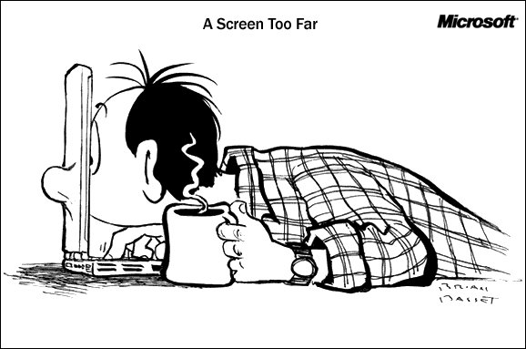 Image Courtesy of Brian Basset and Microsoft Corporation
Tuesday, January 25, 2005
Microsoft's Resource Guide for Individuals with Vision Difficulties and Impairments
I just discovered Microsoft's Resource Guide for Individuals with Vision Difficulties and Impairments. Some of the topics on this blog will overlap with information from this site, but I will try to keep this blog complementary to sites like this. I will try to highlight the more useful accessibility features and to report the benefits and costs that I have found of using the different features. Stay tuned.
The New York Times Large Print Weekly
Here is another off-topic suggestion. This one is for those New York Times fans who like to get your hands inky while reading the news. The Times offers a large print weekly, to which I subscribed for a while. I liked it a lot, especially the Large Print version of the crossword puzzle. I only stopped subscribing since I read the Times online every day.
NYTimes: MoMA Helps Visitors To Use Ears To See
This is a little off-topic, but interesting nonetheless. A few weeks ago the New York Times ran an article, "MoMA Helps Visitors To Use Ears To See" on the front page of its Arts section describing the Museum of Modern Art's launch of a new set of audio guides. One of these audio tours, called Visual Descriptions, is meant to present "extended visual descriptions of highlights from the Museum’s permanent collection especially for blind or partially sighted visitors." MoMA claims that it is the first of its kind. I hope that it is not the last. Audio guides are very helpful for me, even when I can see the exhibition.
You can find out more about this audio guide from Acoustiguide's website. More and more museums seem to offer audio tours, so check with any museum that you visit. It never hurts to ask.
Monday, January 24, 2005
Decreasing your display resolution
Changing your display resolution has both pros and cons. The pros include larger desktop icons with larger text for the operating system, incuuding the Taskbar (in Windows) or the Dock (in OS X). Lower display resolutions only affect the operating system and not the applications you use, so Internet Explorer, for example, won't display larger font sizes. The main con is that not all software is designed to work on low resolution setting, meaning that occasionally windows will extend beyond the edge of the screen. Fortunately, this issue does not occur frequesntly and is easy to rectify by restoring the original display resolution.
You can access your display resolution settings by accessing the Desplay Properties in the Control Panel (for Windows - see the System Preferences on a Mac). When you have the Display Properties window open, click on the 'Settings' tab. There will be a sliding bar called 'screen resolution' on the left side. Move the marker to the left, towards 'less' resoltion. then click 'Apply' and see how you like the changes. It is very easy to change it back by following these same steps (excpet moving the marker towards 'more' resoltion). I recommend testing different display resolutions to see what fits your needs best.
How easy is this blog to read?
I will start off with a critique of my own site. This site is not so bad as sites go. I have chosen to work within the limits of the Blogger.com software and these imply strong resctrictions on my control of the look and feel of this blog.
Blogger.com requires that its 'bloggers' (like me!) use one of its templates. These templates preset the fonts and colors used in the blog as well as how the blog is arrainged. Blogger.com only offers a dozen or so templates, none of which are designed to make reading them easier, though all are quite professionally done. I chose the template with a darker background and good contrast between the font color and the background color. Hopefully this is a good start to making this a 'large print' blog!
Over the ensuing posts, I will show you easy ways to make this site even easier to read, including ways to give you control over the way web sites are displayed on your computer.
Inaugural Message
Welcome to Large Print Ideas. This blog will become the home for all the ideas and solutions that I have found to make computer use a little easier on my eyes. This is not a site for web developers, but a site for regular computer users.
I have been visually impaired all my life and have recently become legally blind. Since I am not totally blind and my vision is only 20/200, I rely on simple solutions to my vision problems. I have found dozens of little tweaks and small changes that have allowed me to keep using my computer without screen readers or other more cumbersome fixes. So this blog should serve not only as a resource for the visually impaired, but also for anyone who finds himself or herself squinting at the monitor or searching for those misplaced reading glasses.
Feel free to add your own comments or contact me with your suggestions or ideas at large.print@gmail.com.
Subscribe to:
Posts (Atom)


 Posts
Posts